At Input I've gotten to work across the whole lifecycle with founders, from brand, to design & marketing, to building and launching products. Building my site was a chance to take some of what I've learned along the way and apply it to something that's entirely mine.
Starting with identity
Before designing anything, I filled out a brand survey to figure out what I wanted the portfolio to feel like and what I wanted it to reflect.
I did some research by looking at other people's portfolios for inspiration, but I wanted this site to feel like me.
My background already tells the technical side of my story, but I wanted the site to show the other things I care about: understanding people, communication, and being creative.
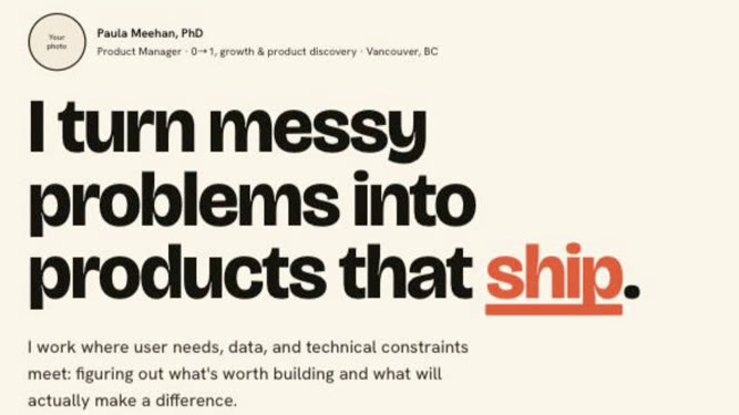
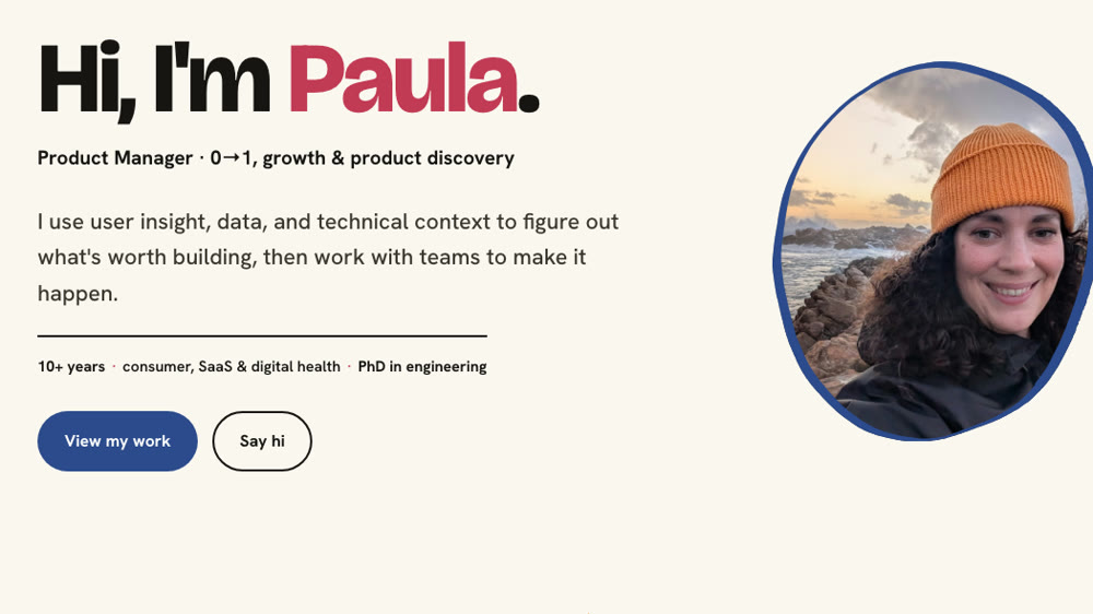
I like to craft in my spare time, and I found I was drawn to websites with an illustrative style, as well as artists like Matisse. So I leaned into warm colours and a crafty direction while keeping the site itself relatively clean.
I didn't want to use stock images, so I drew the shapes in marker, photographed them and turned them into vectors for the site.
The wobble is real.
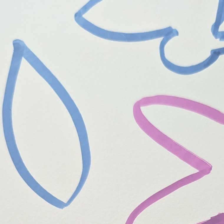
Throwing some shapes
A slightly different team
Normally when I'm building something, there's a team around it (design & engineering). This time, the team looked a little different and I teamed up with Claude and ChatGPT.
I owned the product, vision and design. Claude did most of the engineering heavy lifting, with a lot of back and forth as I reviewed what it built, changed direction, caught things that weren't working and kept refining. ChatGPT helped me work through ideas and refine the copy.
Building this site pushed me to learn things I hadn't done before. I figured out GitHub, deployed the site through Vercel, bought and connected a domain, and set up an email address that routes into my regular inbox.
Building it out
The tools were different, but the process was pretty familiar: scope it, make something, use it, test it, and iterate.
One of my favourite parts of UI work is thinking through the small stuff. I created a design system to keep things consistent, and simplified it when it got too complicated. I rewrote copy and added small details and micro-interactions that made it feel more finished and a bit more fun.
Design system
I leaned on AI for some of the less visible parts too: analytics, a contact button that doesn't expose my email address to scrapers, and the SEO and metadata setup, clean URLs.
I always like seeing the making-of behind things, so I thought I'd share mine too.